When it comes to adapting to an increasingly digital customer, Panera Bread has been far from a late adopter.
“Panera was on the forefront of drive-thru, of kiosk integration, of loyalty app in fast-casual long before other brands started coming along,” said Juliana Strieff, Director of Creative Design and Concepts. “Panera has been a bit of a quiet innovator in experience design for a really long time.”
But, as has been the case for all brands, the past few years forced Panera to take a careful look at what’s next in their evolution. Even before the pandemic, off-premise had come to represent more than half the chain’s sales. In 2021, drive-thru accounted for 52-percent of that amount, a significant jump compared with previous years. It had become clear that the brand needed to update its physical offering to keep up in an age of hyper-convenience.
But rather than merely add on a few features to cater for the uptick in off-premise, Panera took the opportunity to undertake more of a holistic approach, asking, “‘is our on-premise experience doing everything we want it to do?’ This isn’t just an exercise in how to integrate off-premise, or how to integrate drive-thru better or how to deal with everybody who’s enjoying their meals not on-site,” Strieff explained. “It’s also about how to make this a much more compelling interior experience.”
And so began the journey toward Panera’s Next Gen prototype. It’s so far been unveiled at one location in Ballwin, Missouri, and it’s likely that all future Panera locations will emulate the concept. At RestaurantSpaces, Strieff explored how the new design came to be alongside Jamie Cornelius, Executive Creative Director at ChangeUp, the firm that helped them breathe life into the undertaking.
Preparing For Change
Coming up with a new-look Panera would always require more than just new paint and artwork in store — the project would ultimately integrate kiosks, BOH improvements, online order pickup stations, and a new front-and-center bakery display.
Also important was a commitment to flexibility.
“We wanted to look at and challenge the role of the box itself and prepare it for change,” Cornelius said. “We know change is inevitable. How we look at experiences and how you can build that flex into that is key. The 10-year prototype is dead.”
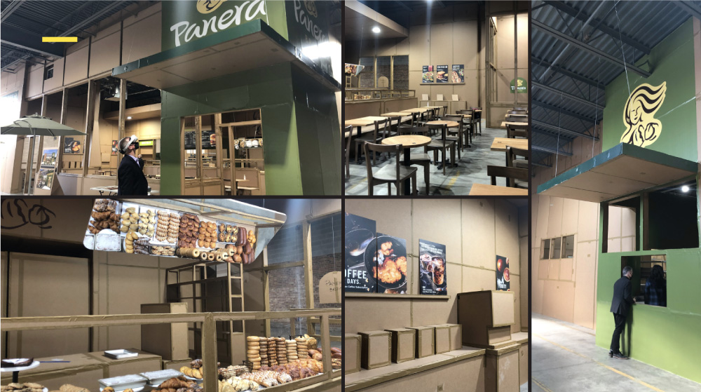
The full-scale mockup Panera created in a Chicago warehouse
At the same time, Conelius said they were also careful to maintain or enhance aspects of the restaurant that customers loved. To properly honor tradition while building for the future, Panera constructed a life-size cardboard replica in a warehouse in Chicago so they could test the design they had in mind. Employees and franchisees alike were brought in to walk through the concept and hone greater efficiency, both in BOH and with whatever was customer-facing.
Strieff noted that while Panera was an early adopter of drive-thrus, kiosks, loyalty programs, and had also established pick-up solutions during the pandemic, they knew those conveniences could be improved upon.
“Convenience needed to be taken to another level,” Cornelius added. “Brand loyalty is not a given and customers are looking for what is new and what is next. So to keep them engaged, we have to keep a fresh and new experience throughout.”
What’s Inside the Box?
Change started inside the café for Panera, firstly cutting the amount of space from 4,500 feet to 3,500 and the seats to just 60 from 120, reflecting the upturn in off-premise traffic. Next was concentrating on wayfinding and crafting a layout that made sense for customers whether they’re picking up a to-go order, staying to dine in, or if they’re a third-party delivery driver.
“We were thoughtful about not just placing shelves for convenience of associates or guests, but what are we asking people to do when they come in?" Cornelius said.
The overall impression customers get when entering was also taken into consideration in a way it never had before. Brand, Cornelius commented, had never really played a big role in previous designs. “They had opted in the past for finishes and colors that created a kind of cozy home-vibe, but it didn’t feel like a Panera home. Bringing the brand to life in an impactful way was really key.”
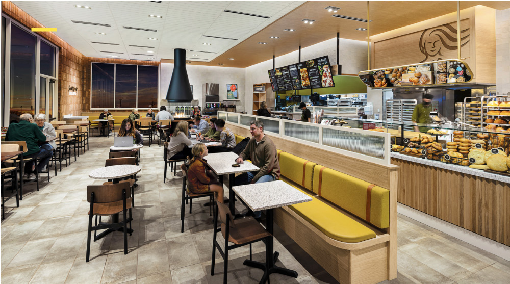
In the Next Gen store, the bakery is the focal point of the experience
In the Next Gen store, guests entering the café are greeted by the warmth and texture Panera has always been known for… but they’ll also immediately see convenience in the form of a feature wall with kiosks, digital screens above the registers, and shelving for pick-up orders.
Perhaps the boldest move was relocating the bakery from the back of the store and bringing it front and center.
“The star of the show is the bakery case, which we brought forward to be part of the journey and to really celebrate it,” Cornelius said, explaining the feature should become a real differentiator for the brand. To enhance the effect, a large mirror has been placed above the display at an angle, allowing dine-in guests to see what’s available, no matter where they’re sitting.
“Part of this redesign was not only bringing this bakery forward, but we changed the operations for how bakers worked. We do day baking now. That led to interesting opportunities,” Strieff said. “We always said we baked fresh daily, but that doesn’t say much if you’re not showing it.”
Outside the Box, Looking Ahead
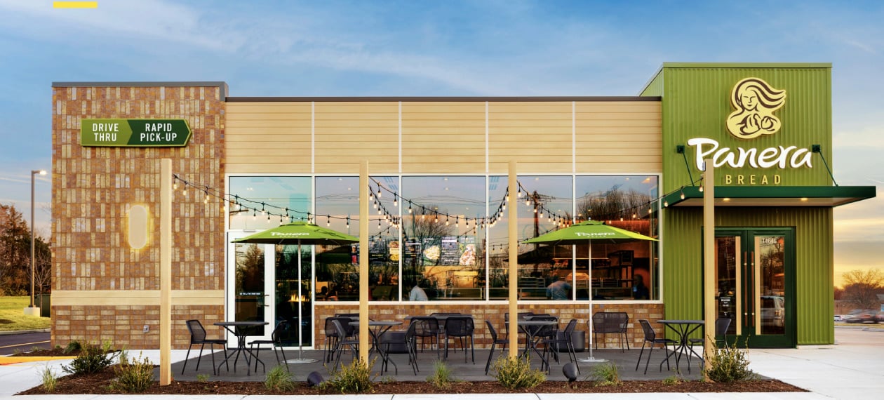
Given the significant increases in drive-thru traffic, this component of the design became the centerpiece of all improvements made to the exterior of the building. Introducing a Rapid Pick-Up lane, or order-ahead lane, was a priority, not to mention making that encounter as frictionless as possible for those using Panera’s app.
“Our loyalty members make up over half of all of our orders. We wanted to recognize loyalty members as they came in, really to make that connection even though they were in the drive-thru,” Strieff said.
Digital menu boards were incorporated into the drive-thru, as well as geofencing, which now allows for suggestive selling opportunities and more of a personalized experience overall.
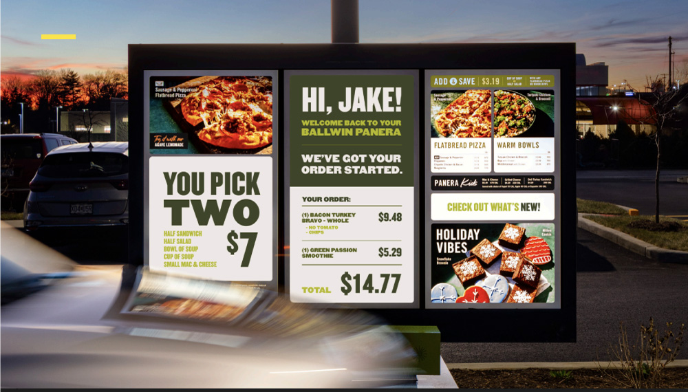
Digital menus boards in the drive-thru are just the beginning of tech innovations to come
This focus on technology has been key across the entire Next Gen project, and will be an area that Panera will continue to hone in on as it looks to the future.
“Revenue from app-based food orders is expected to increase by 62-percent by 2025,” Cornelius pointed out, referring to statistics from CBRE. “We needed to bring in new technology to truly deliver on convenience.”
At the same time, she also highlighted the difficulty in striking a balance between technology and human interaction as brands look to the future.
“Frictionless has become quite the buzzword over the past couple of years and while removing some of that friction has been necessary to a good experience, we have to be careful that we don’t take out all of the friction,” Cornelus said. “We believe there is good friction, one that leaves a stickiness to the experience that creates memorable moments.”
Panera’s Next Gen store has proved an important step as the brand continues to grow at a rapid rate and also represents the adoption of a fresh mindset of exploration, key to navigating the era ahead.
“We never stop innovating and we’re going to keep breaking the model,” Strieff said. “We’re always asking what we’re going to do next.”

Posted by
Chain Restaurants Reimagined.
The Retreat to Reimagine Restaurant Development, Design + Technology.
Oct 18-20, 2026 | Amelia Island, FL




-Feb-12-2026-04-59-31-5890-PM.png)
-3.png)
-3.png)

Comments