The company that leaned into its own fan-fueled reputation as a late-night destination for folks who've had a few (too many?) drinks at the bar by creating a whole ad campaign around the concept of "Fourth Meal" might know a thing or two about branding.
Deborah Brand, VP of Development and Design for Taco Bell and self-professed "left-wing, Republic of San Francisco foodie," recognizes that, and the power such built-in fandom wields. Outside of the company's own efforts, the Taco Bell brand has taken on a life of its own thanks to cheeky memes on social media and particularly loyal (especially for late-night) fans. One of the biggest focuses of her job, then, is to translate the power of that brand identity into a three-dimensional space.
That three-dimensional space must communicate the brand's identity, and authenticity is very important to today's customer – even when dealing with a multi-billion-dollar corporation.
Brand describes the "Numero Uno" store first opened by Glen Bell in Southern California in 1962.
"There was a whole theatre around presenting the brand in this irreverent way," Brand explains, noting that Bell would have mariachi bands and live chickens running around on weekends in the parking lot – because "Mexico," right?
Irreverence is at the core of Taco Bell's identity, and the thing that separates it from other quick-service restaurants, whether they're in the business of burgers or burritos. That irreverence continues to play out when they present new menu items like the Doritos Locos taco, or when they decide to fly a Taco Bell taco truck to a remote town in Alaska because the closest Taco Bell is 400 miles away. And then there is all the fan-generated "fashion," viral social media memes, and celebrities giving the brand shout-outs in songs, Tweets, and interviews.
"This irreverent storytelling [has turned into something] that is bigger than the brand itself, which is a magical thing," she says. "It's a QSR bringing together the social experience that is food. How do I bring this into a three-dimensional space and make some sort of sense out of the magical hodgepodge that it is?"
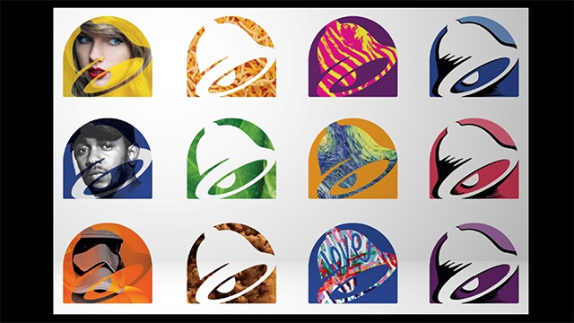 The new Taco Bell logo has the iconic bell image.
Defining the brand is ever more important as a competitive advantage, and that is done through the food, the packaging, the media, the marketing, the events, the fans, but also the interior spaces. For decades Taco Bell hewed close to the philosophy that all stores must look exactly the same inside and out, and to this day any child of the '80s or earlier can easily recognize the outer shells of former Taco Bell locations even if they’ve been converted into something entirely different – like check cashing businesses or dental offices.
The problem, she says, is that as you go into different cities and different communities the buildings take on their own identities; the brand, as a personality, is much more complex than cookie-cutter construction.
"The brand means many things to different people, so we threw out [the identical store concept] a couple of years ago and said, let's strip it down and start redefining the styles that are inherently us," says Brand.
They developed four new design concepts for Taco Bell stores: the "Modern Explorer," which Brand describes as a "materials study" and represents the more sophisticated side of the brand's design; "Heritage," a more grown-up Spanish/Mexican concept inspired by Taco Bell's Mission-style, mini-Tijuana roots; "California Sol," an homage to its roots also as SoCal brand with al fresco dining; and "Urban Edge," representing the brand's more recent push into urban markets.
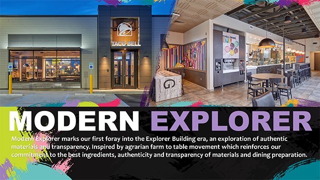
Taco Bell' s new design concept 'Modern Explorer'.
A pop-up store inside a shipping container at South by Southwest was purchased by a franchisee and moved to South Gate, California, and is acting as a test concept for the brand's urban expansion, with no dine-in space but a drive-through window, walk-up window, and patio space for dining outdoors.
The logo was also updated, keeping the iconic bell image but divorcing it from the corporate color palette of pink, purple, and yellow, opening up the possibilities for more playful, unrestricted uses of colors and backgrounds.
"It's all about storytelling. We're trying to build a person," explains Brand. "The brands that survive are the ones that customers relate to as a friend, the ones they invite home again and again. Once you cross over that threshold from being transactional to being a trusted brand that is a friend you can survive a bunch of missteps if you continue to try to innovate and experiment. Customers give you a lot more license."
Part of the storytelling includes indicating where materials are sourced and transparency in design. If a store is outfitted with solar panels, there is signage indicating so to customers. If a store utilizes reclaimed wood in its interior, signage explains where that wood came from (and that it's not just from the "distressed wood factory").
But, Brand says, all that storytelling is also a "total nightmare" for the construction team. With four different building types that continue to evolve and different furniture, fixture, flooring, exterior, etc. packages for each, they're dealing with a whole lot more moving pieces than before.
They addressed this by stripping the store concept down to its most basic parts, getting rid of everything that didn't either have an operational function or tell a story about the brand. They reduced it down to a kit of parts that can be put back together without too much complexity, following the mass production customization template established by car companies and IKEA. This allows them to focus on the elements that are most enriching and even give individual stores unique touches, like murals and graphics by local artists, small runs of unique fabrics, or communal tables made from a decommissioned boat.
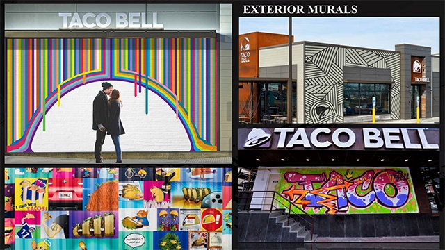 Murals designed by local artists give individual stores unique touches.
The Taco Bell Cantina concept gives them even more opportunity to play, with a whole presentation of an alcoholic beverage program not available in every store. Though not the first Cantina, the Las Vegas location on the Strip is its flagship, which includes a retail section and a wedding chapel upstairs – and yes, people absolutely do get married there.
But, once again, a brand's identity – especially nowadays – extends far beyond the in-store experience, and the brand has been focused on evolving that too. Philanthropic efforts like the Feed the Beat program, which supports unknown and struggling musicians through the brand's in-store music, and Live Más, a scholarship program that rewards genuine passion rather than athletic or academic achievement, allow Taco Bell to be a community partner in ways that are just a little bit different, keeping true to its identity.
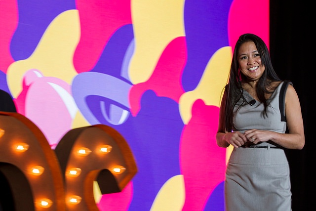
At its corporate offices in Irvine, California, Taco Bell hosted a Taco Bell Test Kitchen Experience on National Taco Day last October that was open to the public via ticket sales on OpenTable. It was the fastest-selling reservation in OpenTable's history. Last summer the brand also partnered with rideshare service Lyft to offer "Taco Mode," an in-app option for late-night Taco Bell drive-through. This year, Taco Bell has partnered with Grubhub for delivery service. And, of course, there are those Vegas Taco Bell weddings – the Strip location is open 24 hours a day and there is always an ordained minister on staff.
"We have always been known as an innovative brand from the food perspective, but now we're carrying that through with our design and introducing the brand as a lifestyle brand and not just a fast-food restaurant," says Brand. "People want to relate to your brand in a more authentic and holistic way versus just 'you sell tacos.' They won't move from a transactional relationship to actually engaging in a relationship with you."

Posted by
Chain Restaurants Reimagined.
The Retreat to Reimagine Restaurant Development, Design + Technology.
Oct 18-20, 2026 | Amelia Island, FL




-Feb-12-2026-04-59-31-5890-PM.png)
-3.png)
-3.png)

Comments