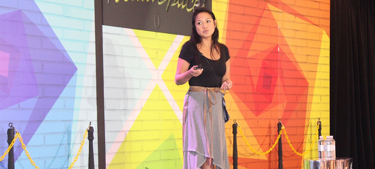
Deborah Brand’s talk at RetailSpaces ended with a bit of a revelation for many— her employer, Taco Bell, is featured on the cover of Fast Company magazine as one of the world’s 50 most innovative brands.
Innovation Begins at Home
“It’s important to start (the rebranding process) from the inside out. You can’t just check boxes; you have to start with internal calibrations. You have to change hearts and minds internally first, because you’re never going to be able to execute it if the people who are actually doing it on a day-to-day basis don’t get what it is that you’re trying to accomplish,” says the VP of Development and Design, who’s CV also includes Old Navy, Bare Escentuals, IT’SUGAR and Starbucks.
“It’s always easy to bring in a very, very talented firm, pay them a pile of money and say ‘we don’t want this anymore,’ give them a one-page brief and say ‘whaddya got?’ but the challenge is making that stick.”
Brand, who studied environmental design, described her team’s experience reinvigorating the original spirit of the Taco Bell brand – including lessons learned through reinvention initiatives at earlier companies, especially Starbucks. Her three-dimensional rebranding emphasizes locally sourced woods, recycled materials (when available), drought-resistant plants, and a subdued aesthetic.
Reflection Leads to Effective Reinvention
A San Francisco/UC Berkeley liberal who “doesn’t eat fast food,” Brand describes the Taco Bell brand in language that admittedly “sounds like a stereotype, but it’s true.”
Her philosophy: “It’s not about food. It’s not about the brand. It’s not about sustainability. It’s about a collective social consciousness. It’s about the people. A stereotype, but it's true.” When Taco Bell management pushed her to apply the same challenging “inside-out” approach she had taken at Starbucks. Brand pushed back. “Are you sure? Because it was very painful. You have to really start with introspection. I told them it’s a journey and people aren’t going to like it.”
Step by Step
They are listening. Her initiatives over the past year have led to four new Taco Bell designs, all of which grew out of a belief that the restaurants should be less about bright paint and branding and more focused on providing “a respectful experience” where people around the country can have dinner out—“$20 for four people.”
By necessity, refreshing such a large chain is always a gradual process, she says. “When you release yourself from having everything be exactly the same, you don’t worry about what’s been in your past. You just make little migrations internally to start telling a story in a different way,” Brand emphasizes.
“You just make little adjustments. When you remodel a house, you don’t make everything perfect the first day…buildings are never done.”
Fresh New Looks
Taco Bell is introducing four new “looks”, each emphasizing a more subdued environment. With fewer bright colors, except for selectively chosen artwork, “We’re stripping back the interior to create a pleasant dining experience.”
”People are trying to have a meal here, and we don’t have to yell at them in orange.”
Inspired by the "modern agrarian farm-to-table movement” and “comfortable in a suburban or rural environment", the first design, Modern Explorer, has been rolled out in Orange County. Larger patios and smaller buildings are the signatures of California Sol, which targets suburban and rural environments. In Brand’s words, “it blurs the style between indoor and outdoor and offers a celebration of al fresco dining.”
The California brand went back to its roots to create the Heritage style, “a modern interpretation of the original mission style Taco Bell. This style enhances our Spanish Colonial Mexican heritage, with warm white walls, classic materials, and classic materials.
“It’s a little less Tijuana and a little more Santa Barbara.”
Created for metro landscapes worldwide, Taco Bell franchisees are slowly coming to terms with the new Urban Edge model (“timeless design married with cutting-edge urban sensibility”), which features reclaimed wood and exposed bulbs. 70% of business will come through freestanding drive-thrus.
Franchisees Customize
As the look of franchise locations changes, Brand stresses that the design of the California restaurant chain has evolved through the years, and was never as homogenized as other chains.
“You saw in our history, there is no one Taco Bell,” she says, adding that new locations will take their lead from the auto industry. “If you buy a car, you pick out your color and your interior, and then you ‘lux’ it up with the stereo. You can end up with a Lux model or the Standard model,” she says.
"Each location doesn’t have to be “completely matchy-matchy.”
Watch Deborah’s full talk below...

Posted by
Chain Restaurants Reimagined.
The Retreat to Reimagine Restaurant Development, Design + Technology.
Oct 18-20, 2026 | Amelia Island, FL


-Feb-12-2026-04-59-31-5890-PM.png)

-3.png)

-3.png)

Comments