If there is one thing Aaron Noveshen wants you to take away from his talk at RestaurantSpaces, it's…well, it's actually five things.
The Founder and CEO of food and restaurant consulting firm, The Culinary Edge, spoke not just about the importance of merchandising, but how effective merchandising actually engages all five senses, not just sight.
"Merchandising is a summation of the elements that communicate the expertise of your brand to your guests," he said. "It's about how you tell your story through all of the senses."
Mostly, when anyone hears the word "merchandising," they immediately think of visual presentation—obviously. But if good merchandising engages all the senses, how do you design merchandising for sound or smell?
"A thoughtful and strategic merchandising approach really creates a sensory experience," he said. "When you engage in all of the senses, it really brings to life the best parts of your brand, encouraging engagement, spending, and frequency."
Smell
So how do you merchandise for smell? Simple: open up your walls and let the smell of your products permeate your store. He mentioned Auntie Anne's, the soft pretzel food court juggernaut that anyone who has been to a mall in the last 20 years is familiar with. Their open store design ensures anyone within 100 feet is tempted by the small and drawn right in. Other places, like Samovar Tea & Chai and Dandelion Chocolate in San Francisco, also use smell to draw people in, with kettles filled with chai tea and chocolate pumping out sumptuous smells throughout the store and out into the street.
"When you engage in all of the senses, it really brings to life the best parts of your brand."
Restaurants are, by their very nature, always filled with smells, but rarely is the smell "designed," nor is the restaurant designed with smell in mind. Not so at José Andrés's Bazaar Meats in Las Vegas, where the very open restaurant design ensures the place is filled with the savory smells of wood smoke and charred meat.
Sound
Sound is something that can be similarly designed to draw people in and boost sales. At places like Seed + Mill in New York, which serves fresh tahini, and Miami's Mr. Bing shaved ice cream, the grinders used to make their products are central to the whole experience, and so is their sound.
Wurstküche, a German beer hall in Los Angeles, has a DJ booth inside that elevates the experience of music in the space. And Yard House, a national beer bar chain, actually curates their entire music program that guests can even stream when they're not at the restaurant, enabling the chain to continue that customer experience outside of its own walls.
Taste
Taste is another fairly obvious sense that food businesses can easily appeal to: give out free samples of your product to encourage people to buy. Places like See's Candies, where every customer who walks in the door gets a free sample, and Eataly, where samples are available everywhere they sell food items, understand that taste is a crucial part of the merchandising puzzle. Always leave them wanting more!
Touch
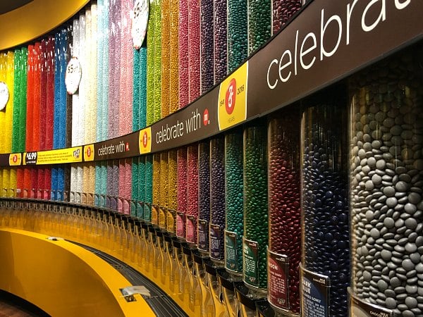
Touch is a bit trickier, because you really don't want every customer man-handling the products you're trying to sell. But, Noveshen said, touch is about bringing guests into the experience, and there are concepts that are able to incorporate some physicality into their store design that makes the sense of touch integral to their business. The theme park-like M&Ms stores in Times Square and Las Vegas are specifically designed for people to touch the huge rainbow-colored displays of M&Ms, filling their own bags of candy from the bulk dispensers.

The popular bulk dispensers in M&M stores
"You can control your experience," Noveshen said of the M&Ms stores. "There are so many reasons to touch and engage with this product. They’ve created a masterpiece of engagement."
As an added bonus, having customers drive their experiences themselves also cuts down on labor.
Pret a Manger, the U.K chain of sandwich shops, has perfected "grab and go" merchandising with the arrangement of items, use of clear containers, and add-on items at eye level to encourage impulse buying.
Sight
The last but most obvious sense in merchandising is sight. We eat with our eyes, after all. There are several different ways to accomplish merchandising through visuals, but, not surprisingly, it often comes down to good design. Noveshen used the example of Starbucks to make his point. The coffee company’s mainstream aesthetic was made to look as warm and cozy as its holiday-flavored lattes. It was a very practical approach to design, and it worked.
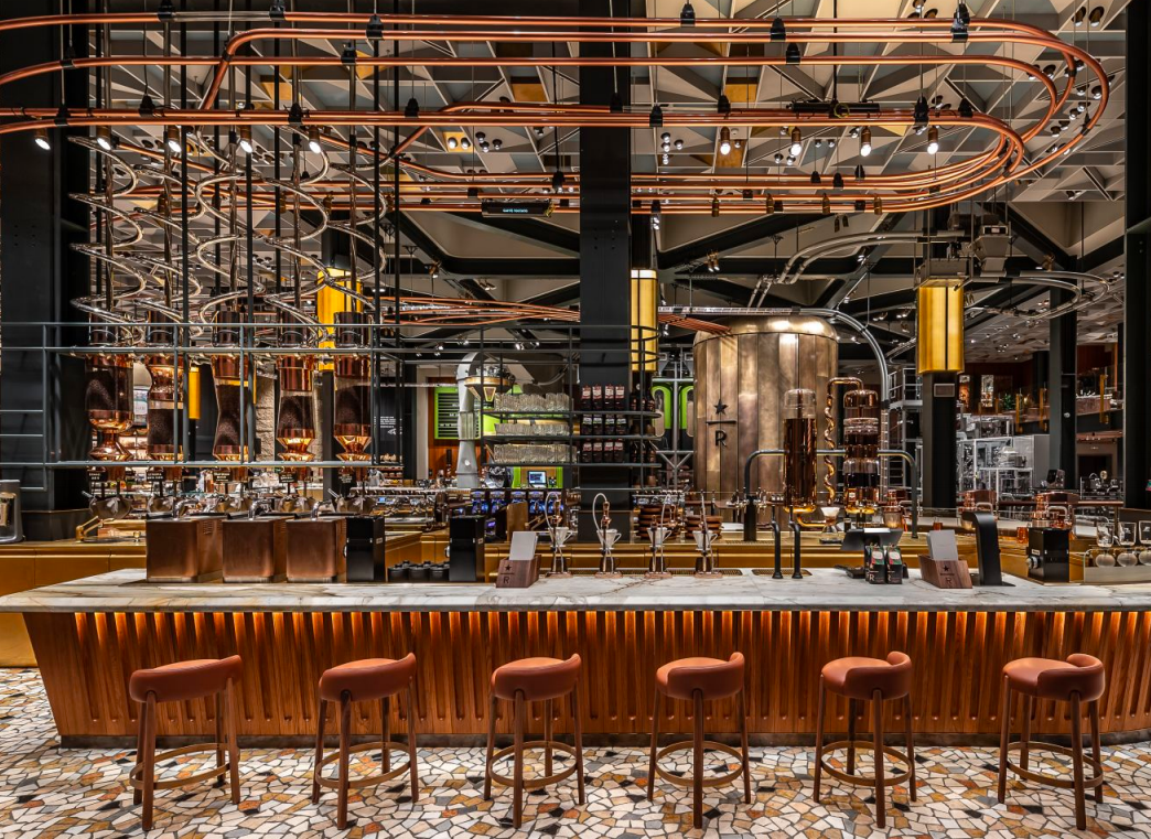
But in recent years, Starbucks has stirred things up with its ultra-sleek Roastery concepts in global cultural capitals like Seattle, Chicago, Shanghai, and Milan.
"This is an absolute narrative on the coffee experience, one of the most beautiful immersive experiences worldwide," he said. "This is really how Starbucks will communicate their expertise."

Starbucks' Roastery concept in New York
Other places rely on their product merchandising through gorgeous displays to tell their story. Gjusta in Los Angeles is a counter-service bakery and sandwich shop, but their beautiful bread displays and Instagram-ready dishes tell their story. Their high-end meat slicer also takes center stage behind the counter, where all deli meats are sliced by hand to order in front of customers. Meat & Bread in Montreal also has beautiful, clean displays of their breads and meats and shines spotlights onto the sandwich building areas to create an active theatre.
"When you have food displays that aren't active, it's really soulless," said Noveshen. "Think about displays that are active, alive, purposeful. Merchandising should be active, not stagnant."
Also in Montreal, the St-Viateur Bagel shop has otherwise unremarkable and dated interiors—but for the piles and piles of giant bagels.
"They literally surround you with their product. It really brings the bagel story to life and they haven't changed it in many years because the story is timeless."
Open kitchens, chef's tables, and prep work spilling out into the dining room are also part of merchandising through sight.
Ultimately, Noveshen advised, don't let the customer experience be left to chance. Invest in some drama, put yourselves in the shoes of the guest, bring your brand's personality to every single touch point, and don't be afraid to have some fun!
Secure your spot at RestaurantSpaces 2020 for the latest in store development + tech. Click here to find out more.

Posted by
Chain Restaurants Reimagined.
The Retreat to Reimagine Restaurant Development, Design + Technology.
Oct 18-20, 2026 | Amelia Island, FL


-Feb-12-2026-04-59-31-5890-PM.png)

-3.png)

-3.png)

Comments