When the latest iteration of Taco Bell’s Go Mobile design opened in El Paso in 2023, it offered a taste of the iconic chain’s future—and the future direction of QSR concepts in general.
At 1,600 square feet, about 900 square feet smaller than a standard Taco Bell, the location was designed to simplify the drive-thru and pickup experience: it did away with the indoor dining area, making room for parking spaces, a walk-up window for pickup and third-party orders, grab-and-go shelves, and two drive-thru lanes.
“We wanted to go back on our roots, creating a really intentional walkup window, and then we have a walk-in vestibule,” explained Chuck Gladney, Taco Bell’s Head of Global Design & Architecture. “If you’ve got a mobile or third-party order, you just walk in, grab your food, and go.”
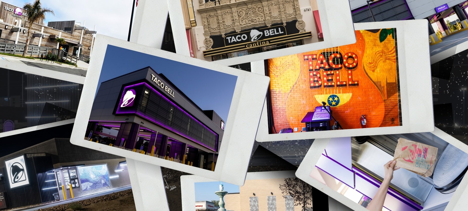
This version of Go Mobile is the culmination of several iterative formats the chain has rolled out in recent years, in addition to a slew of other designs, like the fan-favorite Cantina and the pioneering Taco Bell Defy. During an illuminating conversation at RestaurantSpaces in Los Angeles, Gladney unpacked what problems Taco Bell hopes to solve with its rigorous format experimentation, and why it’s still important to create engaging human-to-human experiences in an increasingly digital world.
 The latest iteration of Taco Bell’s Go Mobile concept in El Paso, TX
Elevating the Drive-Thrue Experience
Taco Bell’s hope for Go Mobile is to create a more seamless drive-thru experience, without the bottlenecks that have become frustratingly commonplace in the age of third party delivery platforms.
“It's been a drain on our drive-thru,” Gladney said. “How can we build restaurants where we still can maintain our typical drive-thru business, but give the aggregators a place to go?”
At the same time, Taco Bell wanted the concept to stand apart from its competitors both conceptually and experientially—much in the way that Taco Bell Defy elevated the brand to a new level of convenience without sacrificing its fundamental identity.
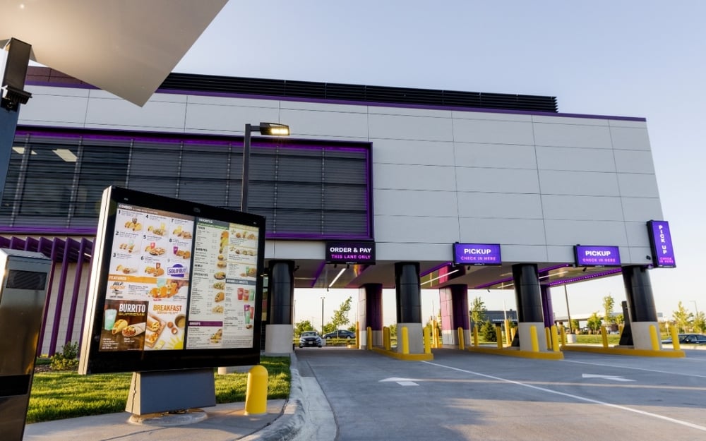
Taco Bell Defy has spurned similar drive-thru innovation at other brands
“How can we make ourselves a little bit different, but lean into our branded elements?” Gladney asked, referring to a picture of the El Paso location. “This bell arch—that’s one of our historic brand elements. We wanted to play with it and bring it to life within this space. We've been working with that idea and putting it into the design of the building.”
Taco Bell has another important goal for Go Mobile: to transform the back-of-house experience, simplifying things for team members and customers alike.
“We're going more kiosk-forward,” Gladney said. “We really want people to order off the kiosk.”
Indeed, as recently reported, in the fourth quarter of 2023, 31 percent of Taco Bell's sales were from digital channels, largely thanks to kiosk orders, which rose by 15 percent. Then there’s the Touch Kitchen Display System, introduced in 2020, that allows team members to assign order priority based on size and complexity. Both strategies make for more efficient, accurate operations, while making team members’ lives easier all around.
The Human Touch
As Gladney pointed out, using technology to streamline the ordering and back-of-house experiences requires a delicate balance.
“What does that do to the team member? Obviously it makes their lives a little bit easier, but also takes away from that sort of human-to-human connection,” he said. “So how do we maintain that experience for the team members? Maybe they're not talking to you, but maybe they're still being seen or they can still see you. There are some things that we're working on where we can emphasize that.”
It’s vital, he added, to design restaurants with their employees top of mind—some of whom may spend their entire careers with Taco Bell.
“In my mind, we have a responsibility,” he said. “We're designing restaurants that sometimes live for decades, and you have people that work a great deal of their lives in our restaurants. I had a meeting not too long ago where we celebrated a manager that had worked at the same restaurant for 45 years. If we can build or design in ways to make their lives easier, that’s important.”
This approach naturally requires agility: what it takes to streamline things in one location may not be what it takes in another, especially when some locations are geared towards third-party orders while others are dedicated to the in-store experience.
“I don't think there's a one-size-fits-all solution,” Gladney explained. “Our plan is making sure we have the right assets for the right location. That could mean dining rooms or no dining rooms. We’re working on options where there’s flexibility within the design, so that our franchisees aren’t forced to build the same thing everywhere.”
A Constant Emphasis on an Iconic Brand Identity
One example of that flexibility is Taco Bell’s location in Grosse Pointe, Michigan, a pickup-forward restaurant with six seats, ordering kiosks, and a Baja Blast fountain that went viral on TikTok. (Technically, it’s a colored water fountain.) As Gladney joked, the location is the result of a simple directive from his boss: to make “the best restaurant in the world.”
From a design perspective, Gladney’s hope for the Grosse Pointe location was to take advantage of the existing building’s height—especially its soaring arches—while stamping it with Taco Bell’s distinct personality.
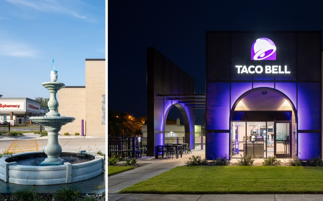
Taco Bell's store at Grosse Point, MI features a Baja Blast fountain—a centerpiece in its drive-thru
“We had the idea that this was something that could be prefabbed and applied to remodels around the world,” he said. “We have 7,500 restaurants. We're constantly in various stages of remodels. Is there a way that we can bring some prefabbed larger branded identity moments into a building that exists, without changing the building itself?”
There’s a similar philosophy behind Taco Bell’s Cantina locations, which offer anywhere from beer and wine to a full bar’s worth of beverage options—and even live music, in the case of a Nashville restaurant whose lease literally requires it. Consider the Cantina opened in Los Angeles last year, in a century-old building that used to be the home of a famous Hollywood bookstore.
“We spent about a year and a half working on this one,” Gladney recalled. “It was a challenge. We had to restore that entire storefront back to the way it looked in 1906; to try to create a design that connected back to a golden age of Hollywood.”
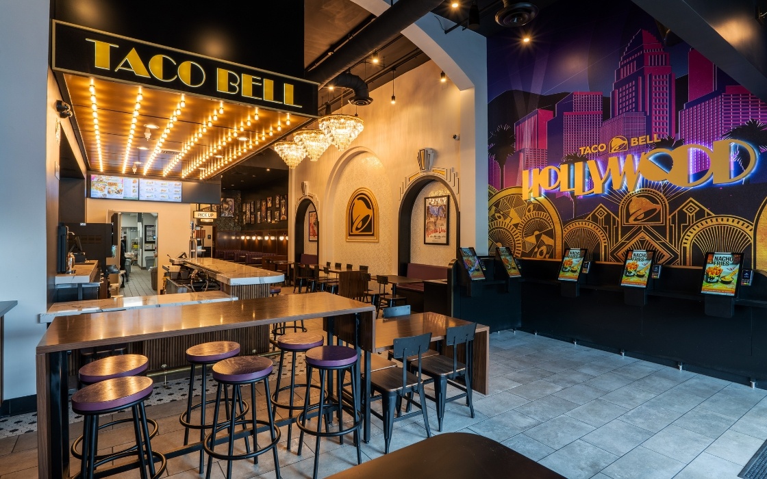
Taco Bell's Cantina location in a century-old building in Hollywood
The location exemplifies the room to play that Taco Bell’s designers enjoy with each new restaurant.
“The brand gives us permission to do really fun things,” Gladney said. “There's little chalupas and tacos in the customer wall covering, there’s signage. Our fans connect with this and almost demand that we do these things.”
Taco Bell sees the Cantina as a sort of billboard for the brand. “It’s one of those things that allows us to connect the brand to the consumer in a little bit more of an intimate way,” Gladney explained. “It creates an expression of the brand that really connects with the consumer.”
Competition As Creative Inspiration
Gladney stressed that this creative approach to design and development is ultimately a team effort—just as it was with Taco Bell Defy, a partnership with Minnesota-based franchisee, Border Foods.
“We wouldn’t have been able to pull this off on our own, and they wouldn’t have been able to pull it off on their own,” he said, describing the endless cycle of inspiration and adaptation that defines the restaurant industry. “We’re always in a cold war of making things better. When you see other brands doing things that are exciting, you’re like, ‘How can I do that better?’ In our world, we have to, because this is what the consumer expects.”
While Gladney couldn’t say exactly what’s next for Taco Bell, he reiterated that whatever it is will be designed with consumers, third-party aggregators, and team members in mind.
“When I came to Taco Bell, I wanted to make sure that from a design point of view, we really focused on the function—instead of just putting new color on the building or a new piece of branding, it’s about making sure that you functionally solve these journeys that people are on,” he concluded. “We’re trying to solve those journeys for everybody, knowing that there will be new innovations that’ll change and tweak that along the way.”

Posted by
Chain Restaurants Reimagined.
The Retreat to Reimagine Restaurant Development, Design + Technology.
Oct 18-20, 2026 | Amelia Island, FL



-Feb-12-2026-04-59-31-5890-PM.png)
-3.png)
-3.png)

Comments